The Ultimate User Guide To The New Kicksite Dashboard User Interface
Kicksite is committed to providing innovative, uncomplicated software to grow your business and simplify your life. We are dedicated to finding new ways to continually improve our martial arts software. If you are a customer of ours, you know we always enjoy hearing feedback from you. We pride ourselves in taking feedback from our users and making improvements to our software based on that feedback. The new Kicksite dashboard is a game changer and this is only the beginning.
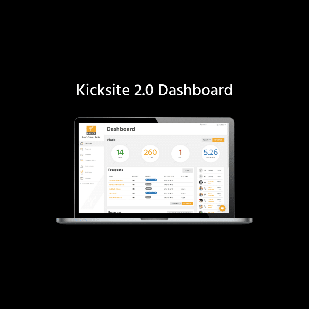
We are excited to announce new enhancements to our martial arts software that will drastically improve your user experience and efficiency running your business. Not only is the new UI dashboard simpler to use, but it includes even more functionality than before. Here is what you can expect from the new user interface:
Updated Design and Organized Layout on the New Kicksite Dashboard
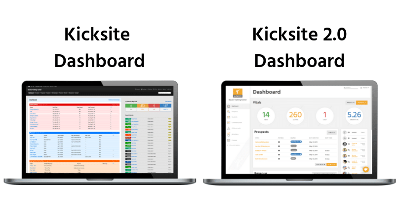
For the new UI look and feel, we took our brand colors and styling and carried it out through the interface. To continue to make things simpler and more efficient, we added in more crisp, open white space so it would feel more positive, bright and less heavy than the classic UI. The primary palette of the new UI consists of a vibrant, yellow paired with a modern charcoal gray. We also kept some of the primary colors in the classic UI for consistency. Overall, we wanted our new chosen font and colors to exemplify our timeless, cutting-edge, sports-centric feel.
Sidebar Navigation

The most exciting change in the UI is streamlining the navigation. Our main navigation header items at the top of the classic UI are now on the left-hand side for easier navigation to the features that matter most toyou. We decided to organize all our items in one place to make it easier to use your Kicksite account.
We decided to move the top main navigation items to the left-hand sidebar to make navigating your martial arts software seamless and natural. No items have been taken away, they have just been organized under other sidebar items to make it easier to understand and find what you are looking for.
Prospects
The Prospects section of the sidebar navigation will take you to the prospecting main Kicksite dashboard. On the propsect dashboard, you will be able to view active potential students, the source they came from, and the ability to create trial memberships, tasks, and set up new appointments with potential students.
Students
The students section will take you to your active student list, the program and rank they are currently in, and help you easily navigate to your inactive, frozen, or absent families within your martial arts business.
Communications
This area of the dashboard will let you see an overview of the communications you’ve sent through SMS, emails, and general announcements. In this area, you’ll create new message flows, email templates, manage your automated messaging, and create new general announcements for your students, prospects or inactive students. In addition, clicking on the calendar area will show you a calendar view of what is scheduled to be sent out.
Achievements
This area is brand new to Kicksite! We added a tab called Achievements where you have access to your testing eligibility and events you schedule for your martial arts studio. We named the section Achievements to encompass all the different events you have for your studio.
BizBuilders
The Bizbuilder dashboard shows you where you can see all of the forms that help grow your business. The most popular forms that our instructors use is Lead capturing, trial memberships, and birthday signups. In this area you’ll be able to view the total amount of leads that have come in with each form and can also create agreement templates / online waivers for new students.
Finances
In the finance section, you can view recurring invoices and record payments. And if you have billing with us, you will be able to go straight to your merchant account to view payments. We merged the two to make it easier for users to find all financial information in one area.
Enhanced Universal Search
We heard from our martial arts gym owners that they wanted more ways to search for students, so we made it happen! A new feature we added is an enhanced universal search. With the classic Kicksite UI, the only way to search for a martial arts student was by the student’s name. Now, with the new UI, you can search for a student, prospect or guardian by name, phone number, and email address. This makes it easier for martial arts business owners to find the student or prospects they are looking for.

Kicksite Dashboard Items
Vitals

The classic UI only had the ability to see more data on vitals if you clicked on it to view more details. With the new vitals, you have a sleek drop down and can easily switch between comparing day/month/week/year.
A benefit to this new vital feature is that it helps you quickly get an overview of your business health and the growth of your martial arts business.
Prospects
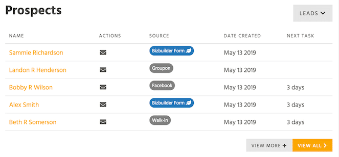
The classic Kicksite UI only allowed to show five primary dashboard items, but now you have the ability to see your prospects and organize the view based on which status you want to see. You can choose to view leads, appointments, no shows, or trial memberships so you can focus on one status at a time rather than seeing all of them combined on one list.
Revenue
Unpaid billing was the only option to view on the homepage with the classic UI. We listened to our users and decided to add a Revenue portion to the dashboard that shows inactive, billing with no vault, past due invoices, and unpaid students. Adding this feature to the UI dashboard will help you manage your money more efficiently so you can keep track of incoming revenue and seeing your business grow at a quick glance.
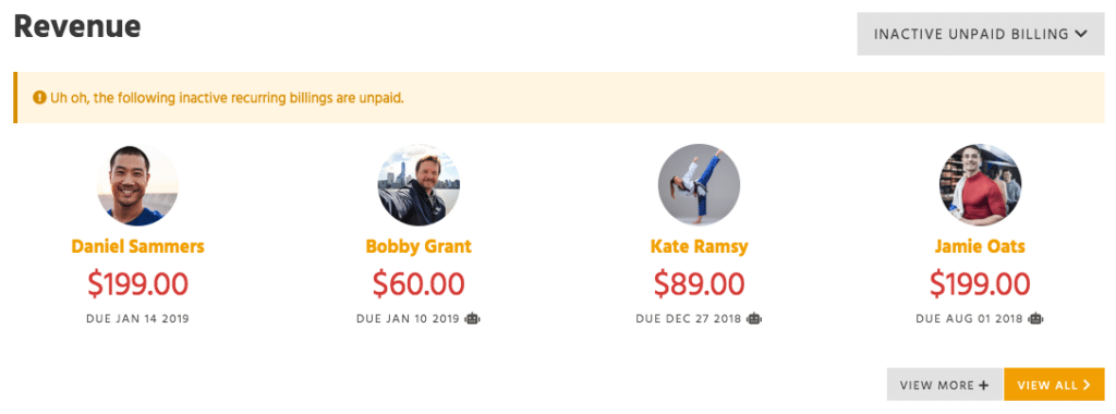
Inactive Unpaid Billing is when a student is inactive but they still owe money based on recurring billing.
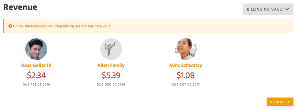
Billing No Vault is recurring billing but they don’t have a credit card on file to automatically pay.
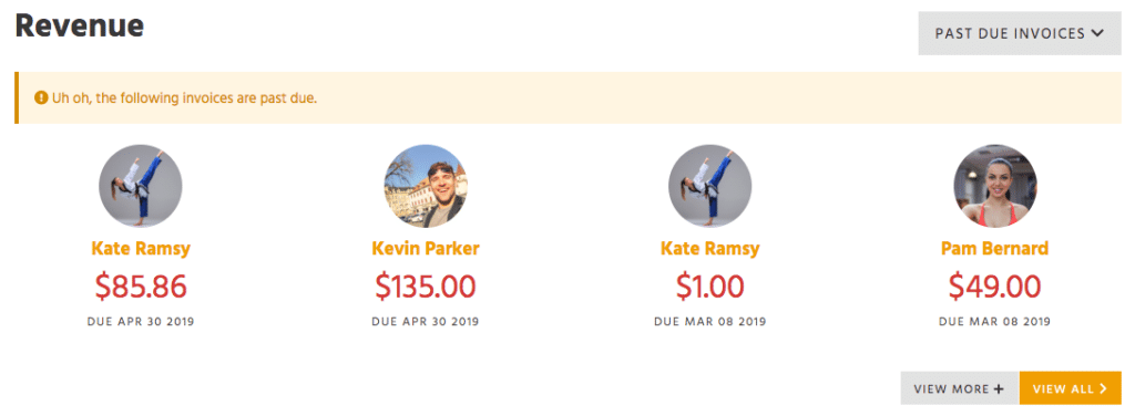
Past Due Invoices is a section that lists people that still owe based on past invoices.
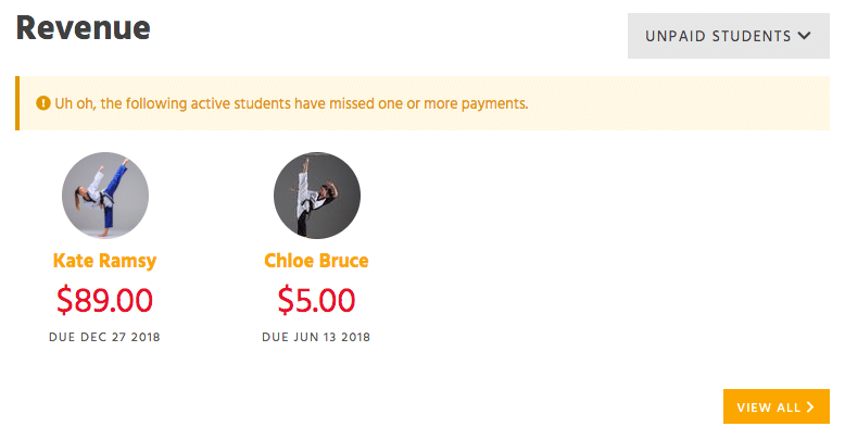
Unpaid Students lists any unpaid students that are active students.
The amount in red shows how much they owe you. If you click on their name it will show you an overview of the recurring billing that has not yet been paid.
Alerts
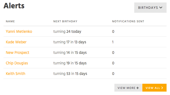
We added an alerts widget to help notify you of important things happening within your student base.
Expiring/Expired Memberships: We added this alerts widget to notify an admin or any members when their membership is soon to expire. The alerts are helpful because they show our martial arts business owners which students are unpaid or expired so they can follow up with them for payment and see how things are going.
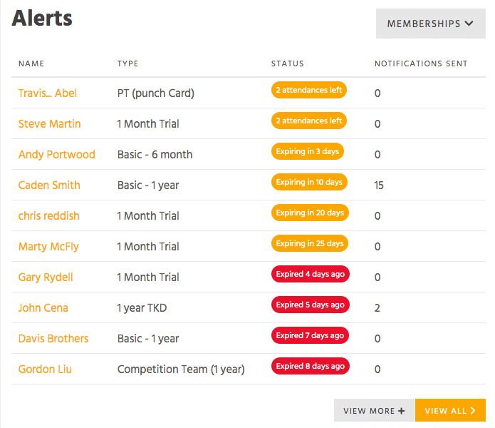
Absent Students: This alert will notify you anytime a student is absent from class or if they have been absent from class for x amount of days.
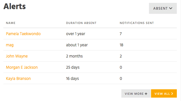
Upcoming Birthdays: This alert notifies you when there is an upcoming birthday of a student. It’s hard to keep track of all your student’s names let alone their birthdays! With this alert, you can easily see who’s birthday is today and how old they are turning. This ensures that you are always making your students feel special.
Add Your Unique Logo
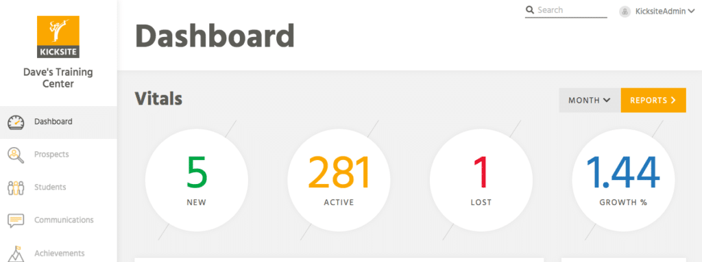
Give your Kicksite Dashboard your own branding with the addition of your martial arts business logo in the left-hand corner!
Admin Items
In the new Kicksite UI, you can find your profile, update account billing, give employees access to the software, manage your employees accounts, open your student check in screen and access your settings. You can also access our knowledge base within the help center to view useful articles, videos and step by step tutorials.

In the account billing section, you can view what Kicksite tier you are in. You can also update your credit card for recurring billing to use our martial arts software.
Under the admin profile, we added a support section that will take you to our knowledge base. This section will give you helpful information on how to utilize Kicksite software and grow your martial arts business.
Student Check-In Screen
This area under your profile will give you quick access to your student check-in screen. We decided to move it under the Admin profile. This will make things easier and more seamless for you when you’re checking students in for class. In the classic UI, the check-in screen was under the attendance tab.
Recent Activity

With the classic Kicksite dashboard, students and employees were just listed out by name. Now with the new UI, we created the ability to add images of students and employees. Students can upload their image themselves in the student portal. This feature helps martial arts instructors remember their students and form a better relationship.
Quick Text / Email
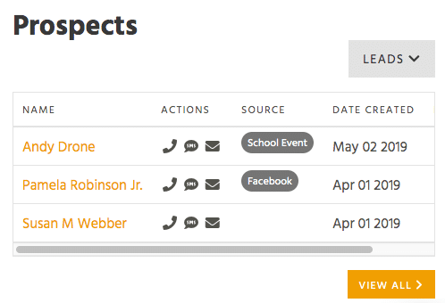
An analysis of more than 2,200 American companies found those who attempted to reach leads within an hour were nearly seven times likelier to have meaningful conversations with prospects. Following up effectively and efficiently is key. With our new dashboard you have the ability to quickly text, email or call prospects right from your Kicksite dashboard. This is a benefit for instructors to be able to quickly communicate with your prospects and have meaningful conversations with them.
Overall, we’re excited to launch the new UI and can’t wait to get your feedback! What are you most looking forward to using from the new UI? We’d love to know!
