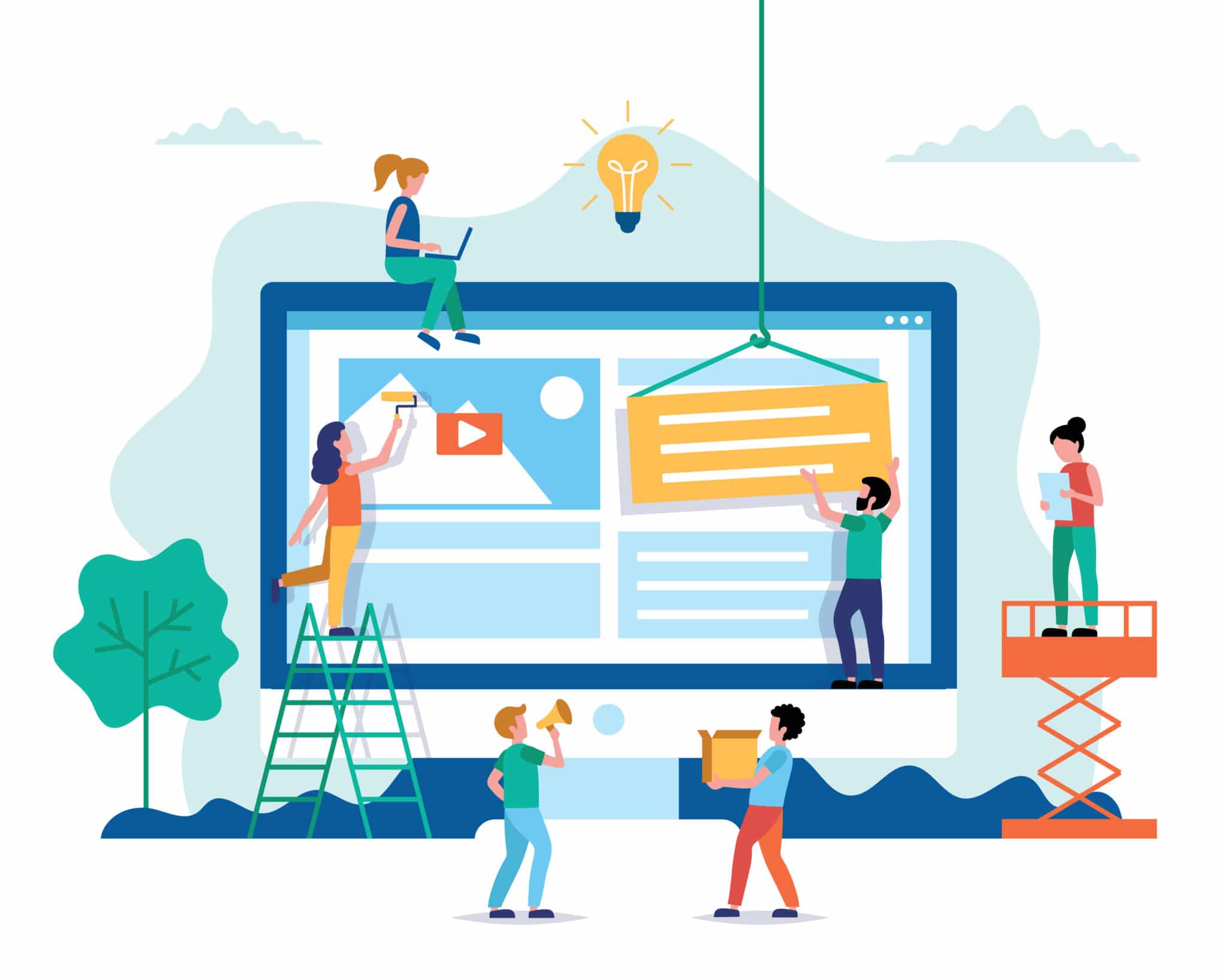
8 Elements Your Martial Arts Website Needs In 2021
Welcome to the age of the Internet, where your website may just determine the success of your martial arts business.
In today’s world, your prospective students are very likely to have their first experience with your gym online. COVID-19 only increases this likelihood – Let’s just say it wasn’t much of a surprise when Amazon announced that their 2020 holiday season was the company’s largest holiday shopping season ever. Online shopping has become the norm, and this major shift in how we research and make purchases doesn’t seem to be disappearing any time soon.
Instead of letting this reality intimidate you, think of it as an exciting opportunity! You now have the ability to control students’ initial encounter with your business in a way you’ve never had before. You can guarantee that visitors to your website will already know just how impressive your school is before ever stepping a foot into your building.
The difficulty isn’t deciding that you need a website…that’s a given. Instead, it’s deciding how to create one that your customers will love.
Now this is where things can start to feel overwhelming. A Google search for “how to make a good website” or “most important website elements” will provide you with literally millions of different answers. And it feels like everyday there is a new must-have feature you need to include on your business’s site just to stay up-to-date.
Here’s the truth: You don’t need a ton of flashy gadgets and complex features to have an amazing website. You just need to know how to utilize a few impactful elements. So, without further ado, here are the 8 elements of web design you need to know in order to make a martial arts website your customers will love:
1.) The Card Concept
Thanks to Pinterest, the card concept has become a staple in modern-day web design. This aesthetically pleasing layout is simple and organized, so it’s no surprise it has taken over the Internet. This design is often referred to as a “container style,” meaning that it allows you to include lots of information in small boxes. Typically each card has one primary idea or theme, though it may include multiple types of mediums, such as text, photo, video, or audio.

So…what’s the big deal?
As we can see in this example from Adobe Creative Cloud, the card design leaves the website user in control, allowing them to choose which topic they want to click on and learn more about. Not to mention, it allows you, the website owner, to include a lot of details in a somewhat small space, all while maintaining a structured and tidy look.
2.) Huge Product Images
When you’re promoting a product, you want it to be at the forefront of your website. It’s important that visitors to your site immediately know exactly what you offer them. Huge product images can show off multiple aspects of your gym and its services, typically including a very large product image with a series of smaller product images clustered around it.
When you’re visualizing this setup, the first thing that probably comes to mind is a website selling a physical product, like clothing or technology. How does this apply to gym owners who are selling a service rather than a product?
Well, lucky for you, the same rules apply! If you’re still stuck, let us help: First, take a look at our example above from Apple. Think about substituting that large image of a laptop with a photo of a student learning in your dojo. Next, replace the complementary images of the tablet, phone, watch, and airpods with images of a student’s belt, one of your smiling front desk attendants, students laughing together, and a shot of your building’s entrance. Get the picture? Now go ahead and add your own twist!
3.) Semi-Flat Design
Before we get to the good stuff, let’s start with some definitions.
According to Interaction Design Foundation, flat design is “a user interface design style that uses simple, two-dimensional elements and bright colors.” In other words, flat design is just that – flat. It’s simple, with no added shading, glare, or highlights.
Well, semi-flat design is pretty darn similar (shocking, we know). Semi-flat designs have the same idea as flat designs, fostering a primarily 2-D appearance. However, these designs allow for a little more wiggle room. This means you don’t have to ditch those realistic aspects of shading, glare, highlights, and other creative endeavors that add subtle depth to your design. Take a look at Netflix’s newest logo to see semi-flat design in action:
Why opt for semi-flat instead of just flat?
Flat design is easy for viewers to grasp and quickly digest. It has become so mainstream in technology and website design that you probably don’t even notice it anymore! While flat design has its benefits, semi-flat design bears a similar look without forcing you to completely let go of all those artistic elements.
4.) Hero Images
When it comes to website design, the hero image is a big deal.
This use of imagery is super powerful, and often leaves the viewer with your business’s biggest takeaway. This feature typically includes a large banner image with a text overlay, and is very central on your website. These elements can either be static or dynamic – you choose!
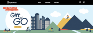
The hero image, like the one above by Hydroflask, is often the very first thing your viewers see when they visit your site. Make sure that it conveys a message that doesn’t just sell your school, but makes them want to scroll down and learn more.
Because your hero image tends to be the most memorable thing about your website’s design, it’s super important to make sure this element is responsive – meaning that your hero image should look great no matter what device, screen size, or platform is being used to view your site.
5.) Background Videos
Ever heard the phrase, “a picture speaks a thousand words?” Well, just imagine what a video can do.
Large background videos are considered to be one of the most engaging elements you can include on a website. (Bonus points if they’re automatically playing videos!) Not convinced? Check out this homepage for Google Arts and Culture and let them do the talking.
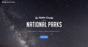
Picture this – a potential student opens your website and is immediately greeted with a high-quality video that tells them everything they need to know about your business and its one of a kind staff and students. Not only does this help them envision themselves as a part of your community, but it frees up valuable space on your site.
Moral of the story? Instead of telling the viewer what your business is all about, show them! Don’t get us wrong, we love words, but we can’t deny the ability of a video to capture one’s attention. The truth is, visitors to your site are wayyy more likely to absorb information presented in a video than in a paragraph.
6.) Hamburger Menus
Before you get too excited – no, we’re not talking about food.
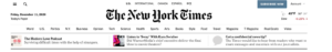
The hamburger menu may sound completely foreign to you, but you probably use it on a daily basis when surfing the web! This element is an icon that looks like three bars stacked on top of one another (hence the name), which many sites use to condense a long list of options on their website. When you click on the button, a larger navigation menu pops up. Sound familiar?
This icon is often placed in one of the top corners of the page, as we can see on the website of The New York Times:
The hamburger menu has become so popular because it saves you space on your site, particularly in versions formatted to fit a cell phone. Since about 2/3 of traffic on the Internet is on mobile devices, this is pretty important to keep in mind. Additionally, it helps maintain organization and creates a site that is easy-to-follow. Too many menu options can quickly clutter your gym’s website and may cause you to lose your viewers’ focus.
7.) Unique and Large Typography
When it comes to text, it doesn’t just matter what words you use, but how you present them. Choosing the right font can go a long way! Think about your favorite brand or company. Chances are, you can automatically visualize that their typography looks like – whether that be the font and sizing of their logo and brand name or even their website interface.
Typography is key to creating brand recognition. With more and more fonts to choose from, you get a say in how visitors will perceive your school. But when we talk about typography, we aren’t just talking about fonts. This term also refers to the size, color, and spacing of your text.
You can use typography to guide the viewer, showing them what is the most important and what is just a minor detail, through your choice of fonts and sizes as well as how you arrange your text. Check out the homepage for Mailchimp’s By The Books pictured above for some inspiration!
8.) Short Product or Feature Videos
In case we haven’t already emphasized the power of video enough, it’s time to talk about product and feature videos.
Let’s face it – attention spans are shorter than ever. Consumers are simply less inclined to read through entire articles or watch lengthy how-to videos. (If you’re still reading this, congrats, you’re one the few!) This is why short and sweet videos that sum up a product or service your gym sells are an ideal way to inform your viewer without losing their attention half way through.
Product videos showcase the benefits of a product or service, and exhibit how they can create a solution to a problem the viewer may have. Ultimately, these videos should be about more than just selling your gym and its services to potential customers. This is an opportunity to show them how your business can better their life and provide them with an experience they’ve been looking for. If you’re looking something to spark your creative juices, watch this video by Training Mask, where they show the benefits of their product:
When it comes to your martial arts school, feature videos allow you to give visitors to your site a preview of what your classes are like, watch clips of student-instructor interactions, and learn more about your values as a business.
When you’re putting together or editing your school’s website, don’t let it overwhelm you. Refer back to these 8 elements and you’ll have a professional and attractive site sure to impress customers in no time!