The Best Martial Arts Websites of 2021
Welcome to the 21st century, where your website is the face of your school. Potential students will search for you on the web before they ever step foot into your space. We get it, this sounds pretty intimidating! But it’s far less scary than it sounds – in fact, it can be pretty amazing. Thanks to the internet, you have the power to control your school’s image and make that perfect first impression.
At Kicksite, we consider ourselves to be pros when it comes to creating show-stopping martial arts websites for school owners. We’ve built top performing websites that bring in new students and establish professional reputations for our more than 1,500 clients – and you could be our next success story.
We could keep talking about how great our work is…or we could just show you! Keep reading to check out 9 of the best martial arts websites we’ve made for our clients so far this year (and find some inspiration for your own site while you’re at it):
1. Lee’s ATA Martial Arts

Let’s start strong with the website for Lee’s ATA Martial Arts. Lee’s has mastered the art of imagery – from their professional photos to their eye-catching and high-quality videos, visitors are immediately given a peek into what it’s like to be a student at their school. Lee’s ATA Martial Arts also showcases great organization, utilizing just one website for their eight different locations. Finally, this website makes new students’ enrollment process quick and simple, immediately providing several offers for visitors to sign up for classes.
2. Seeds 13 BJJ Academy
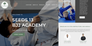
If you’re looking to boost your website’s Search Engine Optimization (SEO), pay a visit to Seeds 13 BJJ Academy. Instead of relying on stock images, Seeds 13 uses their very own beautiful imagery, paired with a simple and modern website design that is easy to navigate from both your laptop or cell phone. Not to mention, Seeds 13 BJJ provides SEO rich content that brings high traffic to their site, producing 140 leads per month!
3. Cobrinha BJJ & Fitness
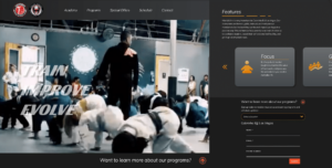
If you want to ensure that potential customers stay on your page for more than 3 seconds, we have the solution – place a video on your homepage. Cobrinha BJJ & Fitness proves this theory. When you visit their page, you’re immediately greeted with a top-notch video that helps visitors imagine themselves training at their school. But Cobrinha doesn’t just have awesome imagery – they also have a way with words. Cobrinha’s features page utilizes wonderful copy, perfectly explaining the advantages of their martial arts training by using descriptive words and specific examples. Lastly, they display their lead converting form on every page of their site, constantly driving conversions.
4. Carlson Gracie Miami
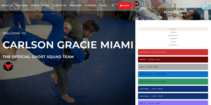
Carlson Gracie Miami does a lot of things right with their website, but one feature we were especially impressed by? Their instructor profiles. Each instructor has a headshot that features them standing in the school and wearing their instructor uniform. Additionally, several of the instructors have biographies that provide visitors with information on their martial arts beginnings, experience, and specialty areas. Your instructors are the heart and soul of your school, so it’s important to help potential students get to know them!
When it comes to choosing your color scheme, It’s easy to go overboard. Carlson Gracie Miami has done an excellent job of utilizing color throughout their website without leaving viewers overwhelmed. Their brand colors of red, gray, and black are sprinkled throughout their website, creating cohesive pages and easy-to-read content.
5. Gentle Art Dojo Florida
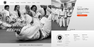
If you want a sleek and sophisticated website, take notes from Gentle Art Dojo Florida. As you create your dream website, you may find that your images clash with your school’s color scheme – it seems that Gentle Art Dojo has found the perfect solution through their black and white imagery with a subtle use of brand color incorporated throughout the site.
Between their instructor bios, contact page, and class schedule, Gentle Art Dojo Florida fosters a highly interactive website design. For example, the class schedule allows users to sort through courses according to level and type, making it super easy for website visitors to find exactly what they’re looking for with just the click of a button. The easier you can make your website to navigate, the better!
6. Edmond Martial Arts Academy

If we’re going to talk about easy navigation, we have to give Edmond Martial Arts a shoutout. Not only is their website extremely organized, providing a specific landing page for each of their programs, but they make it nearly impossible to miss their contact information. By placing a contact form on multiple pages throughout the website, including the footer of their homepage, prospective students will have no problem getting in touch.
Edmond Martial Arts continues to market itself flawlessly by placing a special deal directly in their navigation bar. Though this may seem like an unconventional location for a discount, it ensures that visitors to the website don’t miss out on their new student enrollment offer.
7. Aviv Jiu Jitsu
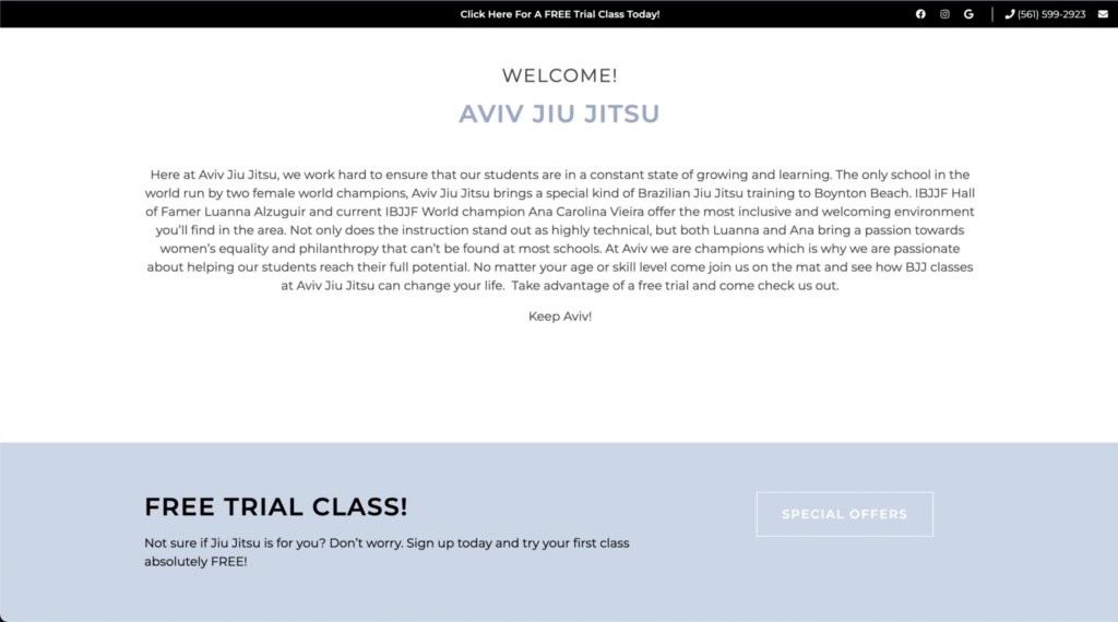
When designing a website, you want to make sure that visitors find the most important details first. So many business owners are wrapped up in what to say that they fail to consider where to say it. That’s why your homepage layout can’t just be an afterthought!
Aviv Jiu Jitsu has done an excellent job of putting this into practice, placing multiple specials on their homepage. Additionally, Aviv Jiu Jitsu has created a very immersive and fun website design. From their instructors page to their schedule, visitors are able to interact with the site every step of the way. Not only does this give the business a more professional feel, but it personalizes the student experience from day one.
8. Neutral Ground Academy

There are a lot of things to love with Neutral Ground Academy’s website. Their page employs a simple and clean design, with the perfect use of orange to make certain sections pop. They’ve also taken a fun approach to their instructor page, making every visitor to their site feel like they’re really getting to know the Neutral Ground staff. Click on an instructor’s name and photograph, and you’ll find their biography paired with several pictures of them training, teaching, and just living life. We’re a huge fan of the personal touch that this adds!
But Neutral Ground Academy has done one thing that really makes their page stand apart from the crowd – their blog. Not only does this original content keep students up-to-date on all school happenings and provide them with important martial arts insights, but it boosts SEO. Two birds with one stone!
9. Tiger Rock Martial Arts Atascocita
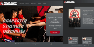
Last, but certainly not least, let’s take a look at Tiger Rock Martial Arts Atascocita’s website. From its vibrant color scheme found on every page of the site, to its original and high-quality photos, visitors are drawn into Tiger Rock from the very first glance. But Tiger Rock isn’t just pretty to look at – it has stellar copy too. Their website features expressive language and thorough descriptions that really help the reader get an idea of what Tiger Rock is all about.
Now that you’ve gotten some website inspo, are you ready to design one of your own? Or maybe just revamp the site you already have? We know that you have an amazing business, but now it’s time to convince all of those potential students. Click here to learn more about Kicksite’s website services – the all-in-one solution to generate more leads and grow your business.
