Kicksite Knowledge Base
How to View Vitals Reports
Kicksite offers many reports and exports you can view or export to see how your business is doing. This article goes over reports on growth and revenue. (Keep in mind that if you do not have billing through Kicksite, you will not have data for the Revenue Report.)
How to review Vitals Reports
On the Dashboard, beside Vitals, click View.
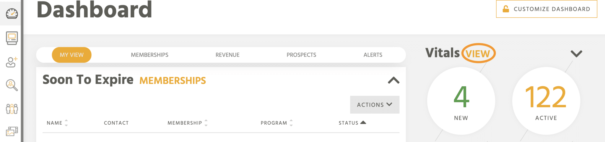
The Vitals Reports page shows graphs for several reports. You can click the View Details link at the top of each graph to see more details and to export the data, if desired.
Here are the Vitals Reports:
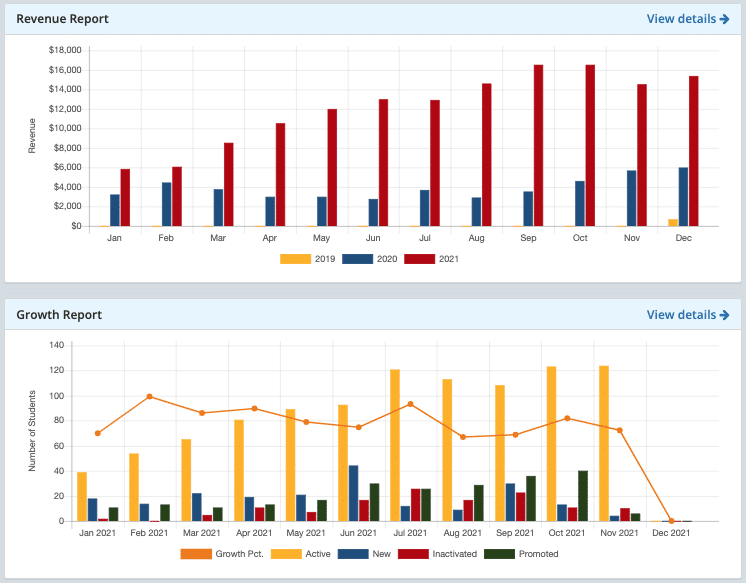
- Revenue Report: Shows your school’s monthly revenue for up to three years as a bar graph. (You won’t have any data in this report if you don’t have billing with Kicksite.) If you click View Details, you see the bar graph and a donut chart for the current month’s revenue. If you scroll down a bit, you can see a list of the transactions made for the current month. Click Export to Excel to download a .csv file of all the month’s transactions.
- Growth Report: Shows you school’s growth as a bar graph. You can see the number of active, new, inactivated, and promoted students for each month of the current year. If you click View Details, you see the bar graph and a donut chart for the current month’s growth. If you scroll down, you see the specific number of active, new, inactivated, and promoted students each month of the current year. Scroll down a little more, and you see a list of students. On the right side, you can filter the report by choosing a Start Date, End Date, Type, and Program. Click the Filter button to apply your selections. Click Export to Excel to download a .csv file with the report.
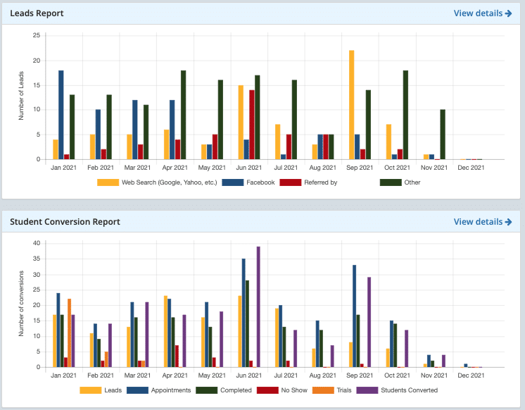
- Leads Report: Shows the number of leads (prospects) entered each month of the current year as a bar graph. If you click View Details, you see the bar graph and a donut chart for the current month’s prospects. If you scroll down, you see a list of prospects entered for the current month. On the right side, you can filter the report by choosing a Start Date, End Date, Source, and Campaign. Click the Filter button to apply your selections. Click Export to Excel to download a .csv file with the report.
- Student Conversion Report: Shows the number of prospects converted to students for each month of the current year as a bar graph. If you click View Details, you see the bar graph and a donut chart for the current month’s conversions. If you scroll down, you see a list showing the number of leads, appointments, completed, no show, trials, and students converted for each month of the current year. A little further down, you see a list of the students converted. On the right side, you can filter the report by choosing a Start Date, End Date, and Type. Click the Filter button to apply your selections. Click Export to Excel to download a .csv file with the report.
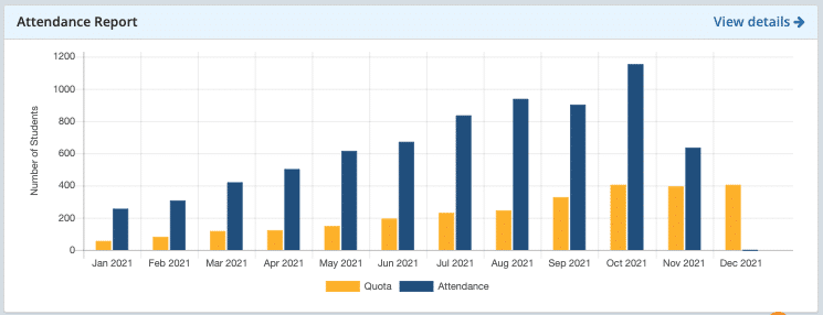
- Attendance Report: Shows the number of attendances for each month of the current year along with the quota (expected attendances) as a bar graph. If you click View Details, you see the bar graph and a donut chart for the current month’s conversions. If you scroll down, you see a list showing the students with recent attendances. On the right side, you can filter the report by choosing a Start Date, End Date, and check boxes to select the program(s). Click the Filter button to apply your selections. Click Export to Excel to download a .csv file with the report.